


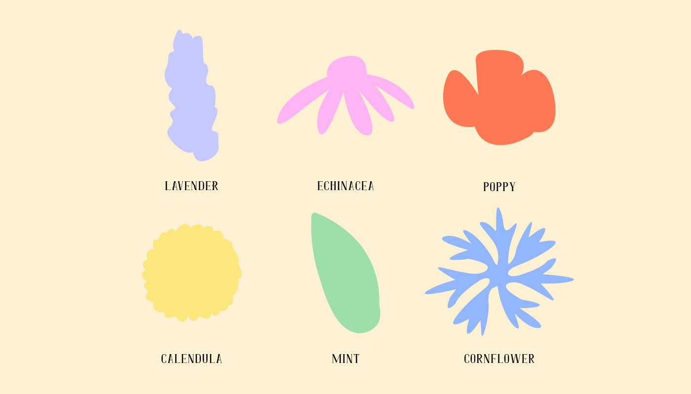
When scrolling Pinterest for inspiration for this brand, I noticed that almost all honey branding is orange/yellow and black. I wanted to change that. So I took inspiration from the flowers that attract honey bees, and created simplistic shapes based on those flowers, using the colours to brighten up the branding. I also used those flowers for different scents for soaps.


Halo Honey Co. was created for a design brief and is a passion project. You can check out other similar passion projects on my Instagram.


